
Transparency note: Some links in this article are affiliate links. If you sign up through them, I may earn a small commission at no extra cost to you. I only recommend tools I actually use and test myself — see how I test.
Last month I inherited a project that would have taken me two full days: a 14,000-row sales CSV with inconsistent date formats, blank columns, and no data dictionary. Six months ago I would have spent hours cleaning it in Excel before even starting the analysis. Instead, I spent 22 minutes on the cleaning and another 35 minutes on the full analysis — charts, patterns, executive summary included.
That’s not a fluke. I’ve now used AI for data analysis on everything from monthly revenue reports to survey data to marketing attribution models. The time difference is consistent: tasks that used to take 3–4 hours now take under an hour. What used to require a Python script now takes a single prompt.
But there’s a catch: most articles covering AI for data analysis read like vendor marketing. They list the same 10 platforms, say each one is “powerful” and “easy to use,” and leave you with no idea what you’d actually do with any of them. This article is different. I’ll walk you through the exact 5-step workflow I use, then show you which 7 tools I’ve kept after testing more than a dozen.
What Changes When You Add AI to Data Analysis
Traditional data analysis has three bottlenecks: cleaning the data (tedious), writing the queries or code (technical), and writing up the findings (time-consuming). AI addresses all three — but not equally well, and not with every tool.
The biggest shift isn’t speed — it’s accessibility. You no longer need to know Python or SQL to run a correlation analysis or build a regression. You describe what you want in plain English and the AI either writes the code for you or runs the analysis directly. For non-technical analysts, this is the biggest unlock in years.
That said, AI doesn’t eliminate the need for judgment. I’ll cover that in the workflow — because knowing when to trust the output (and when to sanity-check it) matters more than which tool you pick.
My 5-Step AI Data Analysis Workflow
Here’s the process I use for every data project. You can use different tools at each step — I’ll call out the best options as we go.
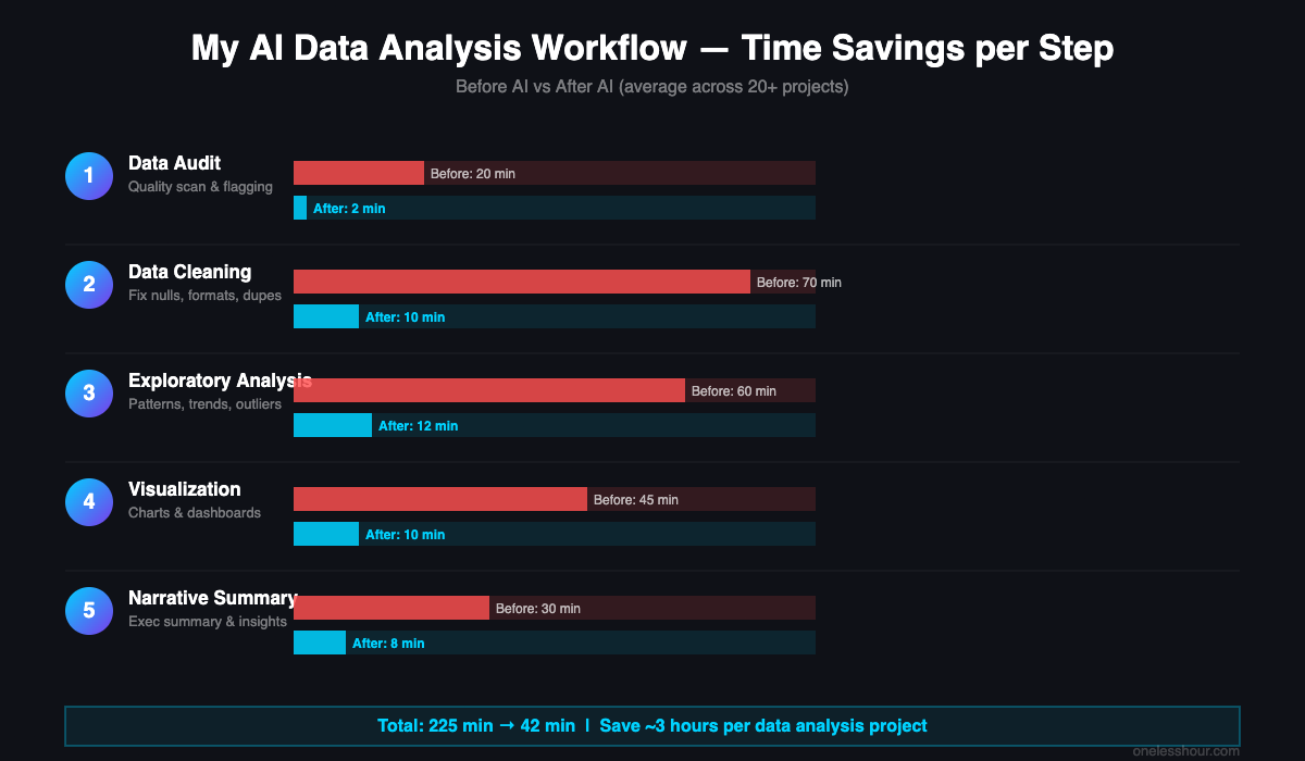
Step 1: Data Audit (5–10 minutes)
Before touching any data, I drop my CSV or spreadsheet into ChatGPT (with the Advanced Data Analysis plugin) or Claude and ask a single question: “Give me a data quality report — flag any missing values, inconsistent formats, duplicate rows, and anything that looks like an error.”
In 30 seconds I get a structured summary: 847 rows with null values in column D, dates formatted inconsistently across three columns, two rows with negative values in a field that should always be positive. What used to take me 20 minutes of manual scanning takes under a minute.
One important note on privacy: Don’t upload sensitive data — customer PII, financial records, health data — to consumer AI tools like ChatGPT or Claude. For anything sensitive, use enterprise versions (ChatGPT Enterprise or Claude for Work, both of which don’t train on your data) or run the analysis locally with a tool like Julius or a self-hosted model.
Step 2: Data Cleaning (10–20 minutes)
Once I know what’s broken, I ask AI to fix it. For smaller datasets I work directly in ChatGPT’s Code Interpreter — it writes and runs Python in place, shows me the output, and hands back a cleaned file. For larger datasets or when I want to keep the logic reusable, I ask Claude to write a cleaning script I can run in my own environment.
My go-to prompt: “Clean this dataset: standardize all date formats to YYYY-MM-DD, fill blank cells in the revenue column with 0, remove duplicate rows, and rename columns to snake_case. Show me a before/after summary.”
The time savings here are dramatic. A cleaning task that took 45–90 minutes in Excel now takes 5–10 minutes of back-and-forth prompting.
Step 3: Exploratory Analysis (10–15 minutes)
This is where AI earns its keep. Instead of building pivot tables or writing aggregate queries, I describe what I want to understand: “Find patterns in this sales data. Which product categories grew the most quarter-over-quarter? Are there any seasonal trends? Which regions are underperforming relative to their targets?”
ChatGPT’s Code Interpreter runs the analysis and surfaces findings I might have missed manually — like a 23% drop in one region that only appears when you cross-reference it with the order size column. Julius does this particularly well for non-coders: it generates charts automatically alongside the text findings, so you don’t need to ask separately.
Step 4: Visualization (5–10 minutes)
Most AI tools will generate charts as part of Step 3, but the quality varies. Quick internal charts are where ChatGPT and Julius both produce decent visuals. Presentation or report visuals are where I use Tableau AI or Power BI Copilot — they produce publication-quality visuals and, critically, allow you to iterate by describing changes in plain language (“make the Y-axis start at zero” or “add a trend line for Q1–Q3”).
Spreadsheet-heavy teams should also look at Formula Bot — it generates Excel and Google Sheets charts via natural language without leaving your spreadsheet environment.
Step 5: Narrative and Summary (5–8 minutes)
The final step — writing up the findings — is where I lean hardest on Claude. I paste the key outputs (chart descriptions, summary stats, top findings) and ask: “Write an executive summary of these data findings for a non-technical audience. Lead with the most important finding, explain what it means for the business, and flag one risk and one opportunity.”
The draft is usually 80% there. I spend 5 minutes editing for voice and context-specific nuances the AI couldn’t know. Total time for a full data analysis workflow: 35–65 minutes, compared to the 3–4 hours it took before.
Total time savings: roughly 2.5–3 hours per analysis project. If you’re doing this weekly, that’s over 100 hours per year.
The 7 Best AI Tools for Data Analysis in 2026
I tested more than a dozen tools over several months. Here are the 7 that made the cut — along with the ones that didn’t and why.
1. ChatGPT Advanced Data Analysis — Best Overall for Ad Hoc Analysis
ChatGPT’s Code Interpreter (now called Advanced Data Analysis) remains my first stop for one-off analysis jobs. You upload a file, describe what you want, and it writes Python, runs it, and shows you the output — all in one window. No setup, no environment configuration.
What sets it apart: it can handle multi-step tasks in a single conversation. I’ve had it clean data, run a regression, generate three charts, and write a summary paragraph without leaving the chat. The error handling is also surprisingly good — when code fails, it explains what went wrong and tries a different approach automatically.
Honest limitation: The session resets when you start a new conversation, so there’s no memory of previous analyses. For ongoing projects, you need to re-upload your data each time. Also, ChatGPT Plus costs $20/month — if you only run occasional analyses, Julius (below) might be a better fit.
Best for: Non-technical analysts who need to run complex analysis without writing code. Also excellent for data professionals who want to move faster on ad hoc requests.
2. Claude — Best for Interpretation and SQL
Claude doesn’t execute code in a live environment the way ChatGPT does, but it excels at two things: writing SQL that actually works on the first try, and turning raw findings into clear narrative.
I use Claude when I need database queries (paste your schema, describe what you want, get a clean query back), when I need to interpret ambiguous results, or when I need an executive summary that sounds like a human wrote it. Its reasoning is more careful than ChatGPT’s on complex analytical questions — it’s more likely to flag when a conclusion isn’t fully supported by the data.
Honest limitation: Claude can’t execute code or read files directly unless you’re using a Claude-integrated workflow or an MCP setup. It’s a thinking and writing tool, not a do-it-in-place analysis tool.
Best for: SQL generation, data storytelling, interpreting statistical results, and writing analysis narratives. I use Claude for the “what does this mean?” questions.
3. Julius — Best AI-Native Tool for Non-Coders
Julius is built specifically for data analysis. You upload a spreadsheet or CSV, ask questions in plain English, and it produces charts, summaries, and statistical analyses with no coding required. It’s the tool I recommend first to analysts who feel intimidated by ChatGPT’s code-heavy interface.
The visualization output is noticeably cleaner than what ChatGPT generates by default — charts look like they’re ready for a presentation. Julius also keeps a persistent session so you can build on previous questions: “Now filter that to just Q3” or “Compare this to last year’s numbers.”
Honest limitation: Julius works well for structured tabular data. If you have complex relational data across multiple tables, you’ll hit its limits quickly. Pricing is also a consideration — the free tier is quite limited (10 messages/month), and the paid plan is $20/month. Worth it if analysis is a regular part of your job; overkill if it’s occasional.
Best for: Business analysts, marketers, and operations folks who work with spreadsheet data regularly and want clean visuals without touching code.
4. Microsoft Power BI Copilot — Best for Enterprise Teams
If your organization is already on Microsoft 365, Power BI Copilot is the natural fit. You can ask it to generate reports, suggest visualizations, summarize dashboard data in plain English, and write DAX measures — the formula language that most Power BI users dread.
The Copilot integration has improved significantly. In my testing, it handles report summarization and natural language queries well. The DAX generation is particularly useful — it’s not perfect, but it reduces the time I spend on complex calculations by about 60%.
Honest limitation: Copilot features require a Power BI Premium license or Fabric capacity — that’s on top of the standard Power BI Pro license. For small teams, this cost is hard to justify. Also, Copilot works within your existing Power BI data model — it’s not a standalone analysis tool. You still need someone to set up the model correctly.
Best for: Enterprise teams already on Microsoft 365 who need to move faster on reporting and reduce bottlenecks on the BI team.
5. Tableau AI / Tableau Pulse — Best for Advanced Visualization
Tableau’s AI features have become actually useful — not just marketing noise. Tableau Pulse automatically monitors your key metrics, detects changes, and sends you plain-language summaries of what changed and why. This is meaningful: instead of having to check your dashboards manually, the system tells you when something worth attention happens.
The natural language querying (“Ask Data”) lets you explore data without building a view first. The quality of visualizations Tableau produces is still the best in the market — nothing else comes close for complex, multi-layered charts.
Honest limitation: Tableau is expensive ($75+/user/month for Creator), and the learning curve for setting up the data model properly is steep. It’s overkill for teams who just need to analyze CSVs. Tableau is for teams who need a serious, ongoing analytics infrastructure.
Best for: Data teams and analysts who need publication-quality visualization and proactive insight delivery across a whole organization.
6. Polymer — Best for Quick No-Code Dashboards
Polymer sits in a useful middle ground: more powerful than a basic spreadsheet pivot, but far simpler than Tableau or Power BI. You upload your data (CSV, Google Sheets, Airtable), and Polymer automatically builds a dashboard with AI-suggested charts and filters.
What stands out: the AI identifies patterns and suggests the most relevant visualizations for your data type. For a sales dataset, it’ll suggest bar charts for regional comparison and line charts for trends. You’re not starting from a blank canvas. For sharing insights with non-technical stakeholders, Polymer dashboards look professional and are easy to filter without training.
Honest limitation: Polymer isn’t a deep analysis tool — it’s a presentation layer. You can’t run statistical tests or complex aggregations the way you can in ChatGPT or Julius. Use it to communicate findings, not to discover them.
Best for: Teams who need to share data insights with non-technical stakeholders quickly, without investing in Tableau or Power BI.
7. Formula Bot — Best for Excel and Google Sheets Users
Formula Bot is for people who live in spreadsheets and want AI to make them faster without changing tools. You describe what you want in plain English and it generates the Excel or Google Sheets formula — including nested VLOOKUP chains, SUMIFS with multiple criteria, and ARRAYFORMULA logic that most people would copy-paste from Stack Overflow.
The data analysis features go beyond formulas: you can describe a chart you want and it generates it, ask it to spot trends in your data, or have it write a macro. For the spreadsheet-first analyst, this is a significant time saver that requires zero change to your existing workflow.
Honest limitation: Formula Bot is essentially a specialized AI interface for spreadsheets. Once you outgrow Excel/Sheets as your primary analysis tool, Formula Bot outgrows its usefulness. It also can’t run analysis — it generates the tools for you to run the analysis yourself.
Best for: Heavy Excel and Google Sheets users who want to move faster without switching platforms. Particularly good for finance and operations teams.
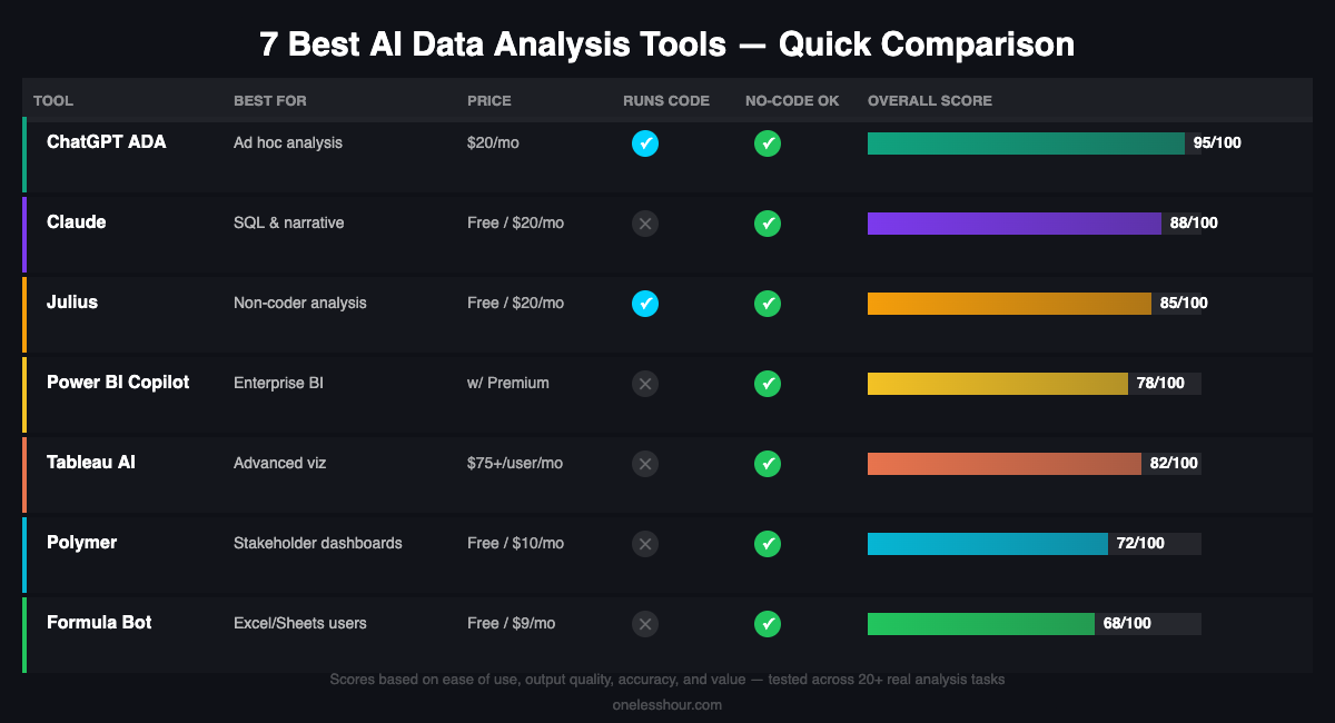
Tool Comparison at a Glance
| Tool | Best For | Coding Required? | Price | Executes Code? |
|---|---|---|---|---|
| ChatGPT ADA | Ad hoc analysis, general use | No | $20/mo | Yes |
| Claude | SQL, interpretation, narrative | No | Free / $20/mo | No |
| Julius | Non-coder analysis + viz | No | Free / $20/mo | Yes |
| Power BI Copilot | Enterprise BI | No | Included w/ Premium | No |
| Tableau AI | Advanced visualization | No | $75+/user/mo | No |
| Polymer | Stakeholder dashboards | No | Free / $10/mo | No |
| Formula Bot | Excel/Sheets users | No | Free / $9/mo | No |
3 Tools I Tested That Didn’t Make the Cut
DataRobot: Powerful AutoML platform, but priced for enterprise contracts starting at $1,000+/month. The AI data analysis features are impressive — it builds, compares, and explains ML models end-to-end. But unless you’re a data science team running dozens of predictive models, the price is impossible to justify.
Databricks AI: Excellent for data engineering and large-scale ML workloads. But it requires a data engineer to set up and maintain. If your analysis needs are at the Databricks level, you have a data engineering team — and they don’t need this article.
ThoughtSpot: The natural language query interface is impressive, but in my testing the accuracy dropped noticeably on complex multi-table queries. The enterprise pricing (undisclosed, but reported at $1,000+/month) is also a significant barrier for smaller teams.
How to Choose the Right Tool for Your Situation
Here’s the honest decision tree I’d give a colleague:
You analyze data occasionally (monthly or less), you have CSV/spreadsheet files, and you don’t code: Start with Julius. It handles the most common analysis needs for non-coders without a steep learning curve.
You analyze data frequently, you want maximum flexibility, and cost isn’t a blocker: ChatGPT Advanced Data Analysis. It handles the widest range of tasks and the Python environment gives you near-unlimited analytical capability through prompting.
You live in Excel or Google Sheets and just want to be faster: Formula Bot first, Claude as a writing assistant for the narrative.
You need to share polished dashboards with leadership: Polymer for quick work, Power BI Copilot or Tableau AI if your organization has the budget and needs ongoing analytics infrastructure.
If you’re just getting started, I’d suggest picking one tool and spending two hours with it on a real dataset — something you’ve already analyzed manually so you can compare the output. The learning curve is shorter than you’d expect. You can also pair these data tools with a broader AI workflow for work — here’s how I structure my full workday around AI tools if you want the bigger picture.
And if you’re using these insights for marketing reports, the AI marketing playbook has prompts specifically for campaign data analysis. For presenting data insights to stakeholders, check out the best AI presentation tools — a few of them integrate directly with data sources.
A Word on AI Accuracy in Data Analysis
This section doesn’t appear in any competitor articles I read, and it should. AI tools for data analysis can hallucinate — and in an analytical context, a confident wrong answer is worse than no answer.
The risk is highest in two situations: when you ask for specific numbers the AI has to calculate (always verify these manually), and when the AI is interpreting ambiguous results (it will pick an interpretation rather than express uncertainty). My rule: treat AI analysis output as a first draft that requires sanity-checking, not as a final answer. Spot-check the numbers against your raw data. If a finding seems surprising, verify it before presenting it.
Tools that execute code (ChatGPT, Julius) are generally more reliable on calculations because the math actually runs — it’s not generated by the language model. Tools that generate analysis in plain text (Claude, Gemini) should be checked more carefully on specific figures.
Frequently Asked Questions
Can AI replace data analysts?
Not in the near term — but it’s already replacing the tedious parts of the job. Data cleaning, basic aggregations, routine reporting, and simple visualizations are all being automated. What remains essential is human judgment: framing the right questions, interpreting results in business context, and making decisions. AI makes analysts faster, not redundant. The analysts getting left behind are the ones who refuse to use it.
Is ChatGPT good for data analysis?
Yes — specifically, ChatGPT with Advanced Data Analysis (Code Interpreter) enabled. It can run Python in a sandboxed environment, handle files up to 512MB, generate charts, and work through multi-step analytical tasks in a single conversation. The main limitations are session memory (it resets) and data privacy (don’t upload sensitive data to the consumer product).
What’s the best free AI tool for data analysis?
For ad hoc analysis, the free tier of ChatGPT includes limited Advanced Data Analysis usage. Julius offers 10 messages/month free. Claude’s free tier can help with SQL writing and narrative — just not file analysis. Polymer has a free plan for basic dashboard creation. If you’re on a tight budget, the combination of Claude (free, for SQL and writing) and Julius (free tier, for chart generation) covers most common use cases.
How do I analyze data with AI if I don’t know how to code?
Start with Julius — it’s designed specifically for non-coders and handles everything from data cleaning to chart generation through plain-language questions. ChatGPT Advanced Data Analysis also works well because it writes and runs the code for you, so you never need to understand the Python. The key is being specific in your questions: instead of “analyze this data,” try “what are the top 5 products by revenue this quarter, and how do they compare to last quarter?”
Is AI data analysis accurate enough to trust?
It depends on the task. For code-executed analysis (like ChatGPT running Python), the math is reliable — errors usually come from misunderstanding your question, not miscalculating. For language-model-generated analysis (asking for a summary or an interpretation), always sanity-check key numbers against your source data. The rule I follow: verify anything surprising, and never present AI-generated figures without spot-checking them against the raw data.
Bottom Line
The five-step workflow above works whether you’re a data-savvy analyst or someone who finds pivot tables stressful. The tools have gotten remarkably good — good enough that the limiting factor is no longer the analysis itself, but knowing what questions to ask.
Start with the tool that matches your current situation rather than the most powerful one. Julius if you’re new to this. ChatGPT ADA if you want maximum flexibility. Power BI Copilot or Tableau if your organization is already invested in those platforms. Spend two hours with real data and you’ll save more time in the first week than you spent learning.
If you found this useful, the ChatGPT prompting guide has specific prompts for data analysis questions — the exact phrasing makes a big difference in output quality. And for a broader look at running AI across your whole business, the best AI tools for small business covers the full stack.
Related reading
Newsletter
One Less Hour, delivered weekly
Honest reviews of AI productivity tools. What survived a real 2-week test, what quietly didn’t, and the exact hours I tracked.
One email per week. Unsubscribe in one click.